- Home
- 주요 악기
-
혁신적인 솔루션
섬유 생산 과정에서 색상 일관성은 복잡하고 다양한 요인에 의해 쉽게 영향을 받으며 색상 테스트 및 관리는 제품 품질과 일관성을 보장하는 핵심입니다.
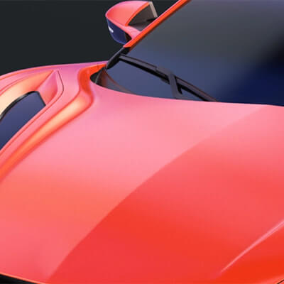
자동차 제조 및 자동차 부품 제조에서 색상 일관성과 정확성은 차량의 외관, 브랜드 이미지 및 고객 만족에 직접적인 영향을 미치기 때문에 매우 중요합니다.
플라스틱 산업에서 색상 측정은 주로 제품의 일관성을 보장하고 브랜드 이미지를 유지하고 품질 관리를 강화하고 고객 만족도를 높이는 데 매우 중요합니다.

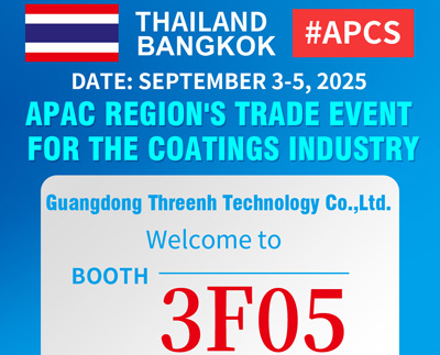
코팅의 색상 관리는 제품 품질과 시장에서 경쟁력을 유지하는 데 중요합니다.
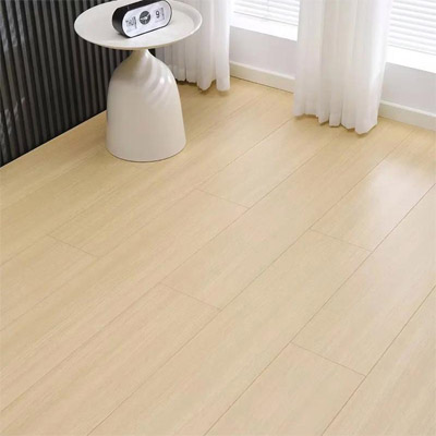
건축재료 솔루션에서 정확한 색깔을 보장;건물 및 장식 재료 산업의 색상 관리는 제품의 미적 매력, 일관성 및 시장 경쟁력을 보장하는 데 매우 중요합니다.
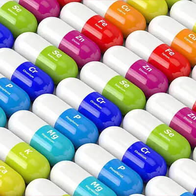
의료 재료의 색상 관리는 제품 기능과 안전성을 보장하는 데 중요합니다.
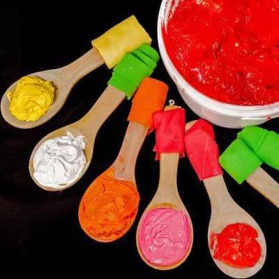
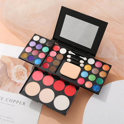
화장품 산업에서 색상 테스트는 제품 품질 및 브랜드 이미지를 보장하는 데 중요하며 제품 개발 및 시장 성능에 중요합니다. 3nh 화장품 색상 측정에서 서비스를 제공합니다. 색상 관리, 측정 및 제어의 중국 리더는 화장품 분광광계기, 밀도계기, 색상 측정 및 색상 측정 소프트웨어를 제공합니다.
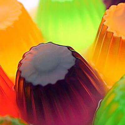
색깔 테스트는 제품의 외관과 매력에 영향을 미치는 뿐만 아니라 품질과 신선함을 반영하기 때문에 생산물 및 식품 산업에서 중요한 역할을 합니다.
포장, 인쇄 및 종이 제품 산업에서 관리의 중요성은 여러 주요 분야에서 반영됩니다.3nh 인쇄 색상 측정에서 서비스를 제공합니다, 3nh 색상 관리, 측정 및 제어에서 중국의 선도자이며 인쇄 분광광계기, 밀도계기, 색상계기 및 색상 측정 소프트웨어를 제공합니다.

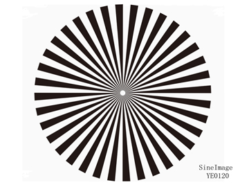
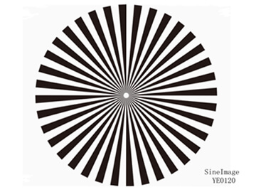
이미지 테스트 실험실 솔루션, Sine Image의 주문을 받아서 만들어진 이미지 테스트 실험실은 광각 테스트 라이트 박스, 고정 색 온도 테스트 라이트 박스 7 세트, 다양한 테스트 차트 (피부 색깔 테스트 차트, 해상도 테스트 차트, 왜곡 테스트 차트, 실제 장면 주관적 테스트 차트 등과 같이), 차트 홀더, 채우기 조명 및 기타 장비를 갖테스트 솔루션과 제품은 보안 모니터링, 자동차 이미징, 사진, 의료 이미징, 텔레비전 및 컴퓨터, 휴대 전화 및 드론과 같은 산업에서 이미지 품질 검사를 위해 널리 사용됩니다.

-
서비스 및 지원
외관 및 색깔 측정 기기에 대한 자주 묻는 질문, 이 페이지에서 우리의 측정 기기 장비의 대부분에 관련된 몇 가지 자주 묻는 질문과 팁을 찾을 수 있습니다.Threenh의 제품에 대한 질문이 있습니까?
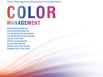
카탈로그, 브로셔, 플라이어, 인증서, 기술 정보 등;모든 문서 요구 사항은 색깔 분광광계를 잘 이해하기 위해 여기에서 다운로드하십시오, 광택 미터, 색깔 평가 장 제품, Threenh 기술은 연구 및 개발, 생산, 판매 및 기술 서비스에 전념하는 정밀 계기 회사입니다.
IQstest는 3nh의 SINE IMAGE 회사가 개발한 이미지 테스트 소프트웨어이며, 해상도 차트、ComprehensiveCharts、Dynamic Range Charts、Gray Step Charts、Distortion Charts、ColorChecker、White、Balance Charts、Fov Charts、Custom Charts를 지원하는 이미지 검사에서 많은 년의 경험이 있습니다.

PeColor 색깔 일치하는 소프트웨어, 전반적인 색깔 솔루션에 초점을 맞추고, 분광 광도계 +PeColor는 색깔 일치를 너무 쉽게 만듭니다!
Threenh는 당신에게 품질 판매 후 서비스를 제공합니다.문제 해결, 수리 또는 유지 보수 계약이 필요합니까?우리 팀에 연락!3NH 보장 조건;광동 Threenh Technology Co., Ltd. (이하 "3NH")은 이 보증 정책 (이하 "3NH")의 조건에 따라 3NH (이하 "제품")이 제조한 제품을 구매한 고객 (이하 "고객")에게 제한된 기간의 보증 서비스를 제공합니다.

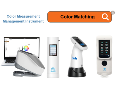
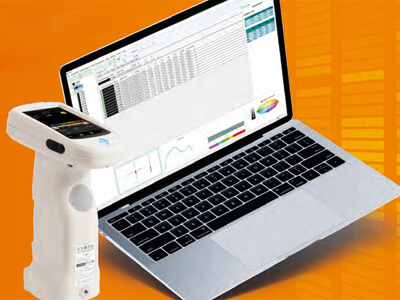
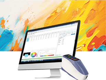
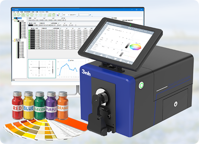
3nh 다양한 색상 품질 관리 소프트웨어 솔루션을 제공합니다.아래에는 일반적인 소프트웨어 프로그램과 관련 정보가 있습니다: 3nh 품질 관리 소프트웨어에 대한 소개가 있습니다.

귀하의 팀에 저렴한 고성능 코로로미터 및 분광광도계 장치를 제공하십시오.개인화된 ODM 디자인 및 서비스를 제공하는 고객의 요구에 따라, 고객이 브랜드의 경쟁 이점을 향상시키도록 도와줍니다.지금 당신의 악기를 자유롭게 사용자 정의!
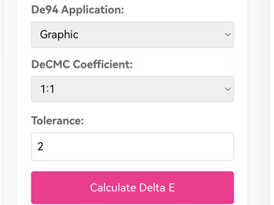
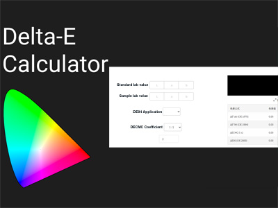
표준 색상과 샘플 색상의 CIE Lab 값을 변환하는 것을 포함합니다.이 도구는 이러한 값을 입력한 후 CIEDE2000 수식 (CIE 2000)에 숫자를 추가하여 올바른 색상 차이를 찾을 수 있습니다.
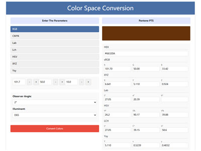
색상 변환기, RGB CMYK HEX Lab Lch HSV XYZ 원 클릭 변환, 전문 색상 공간 도구, 쉽게 RGB CMYK HEX Lab Lch HSV XYZ를 Pantone (PMS)로 변환 우리의 변환기로 간단한 정확한 변환 색상 공간 도구를 시도하십시오.
-
자원
3NH 회사 뉴스 센터, 뉴스 및 이벤트, 흥미로운 개발, 우리의 뉴스 센터는 회사와 우리가 번영하는 산업 내에서 최신 사건과 개발의 역동적 인 허브로 역할합니다. 여기에서 혁신과 우수성을 지속적으로 추구하는 데 대한 독점적인 통찰력을 얻을 수 있습니다.색상 관리 리더 3NH 최신 뉴스
색상 관리의 리더로부터 최신 제품 뉴스, Threenh의 모든 최신 뉴스를 최신 정보로 유지하십시오!최신 혁신, 채용 발표, 새로운 제품, 보도자료 등을 발견하십시오.
threenh 기술의 최신 기술 뉴스 및 측정 제품을 발견하십시오.비즈니스를 위한 혁신적인 기술 솔루션이나 측정 기기를 지금 구매하십시오!당신이 무엇을 측정하고 싶어하든, 우리는 올바른 색깔 측정 도구를 찾을 수 있도록 기초를 만들었습니다.
세 가지 기술로 필수적인 기본 색상 지식을 얻으십시오.비즈니스 요구에 맞는 스마트 솔루션을 탐색하십시오.오늘 저희에게 연락!여기서 전 세계에서 다가오는 컬러 테크 및 스타트업 이벤트를 찾을 수 있습니다.
Transmistance란 무엇인가
색깔 내성은 무엇입니까?
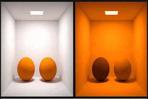
Metamerism 란 무엇입니까?
가드너 색깔
델타 E 란 무엇입니까?
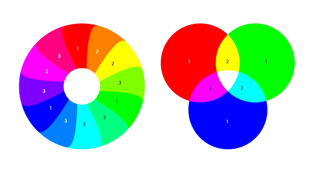
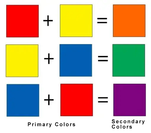
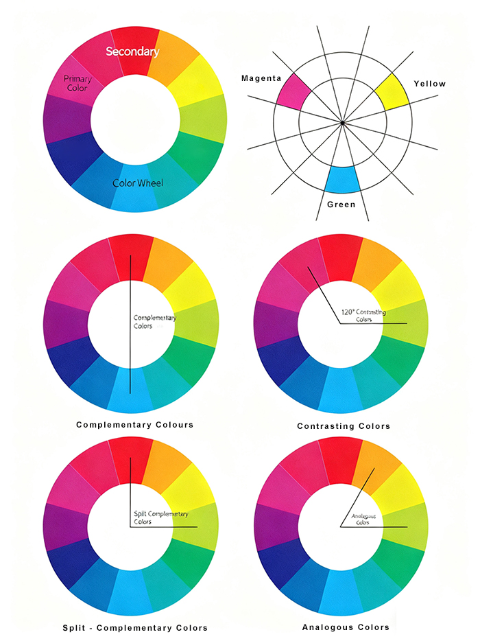
3 주요 색깔3NH 산업 뉴스 센터, 뉴스 및 이벤트, 흥미로운 개발, 우리의 뉴스 센터는 우리가 번영하는 산업 내의 최신 사건과 개발의 역동적인 허브로 역할합니다. 여기에서 혁신과 우수성을 지속적으로 추구하는 데 대한 독점적인 통찰력을 얻을 수 있습니다.색상 테스트 및 정확한 품질 관리 불명확한 응용 프로그램에 대한 이해를 향상
-
Threenh에 대해
우리의 최신 제조 시설을 통해 가상 여행을 시작하십시오.우리의 생산 라인의 정밀성과 효율성을 목격하십시오. 그들은 우리의 고품질 장비와 기타 고급 제품을 생명으로 만들고 있습니다.

고객에게 측정 기기 제품 및 ODM 서비스의 완전한 범위를 제공함으로써 다양한 시장에 솔루션을 제공합니다.신중한 재료 소싱부터 정확한 조립 및 엄격한 품질 검사까지 모든 단계는 효율성, 일관성 및 국제 표준 준수를 보장하기 위해 신중하게 조직됩니다.

계정 이름: 광동 ThreeNH Technology Co., Ltd.

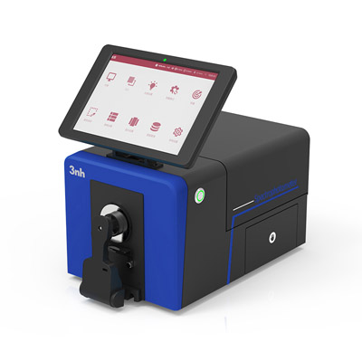
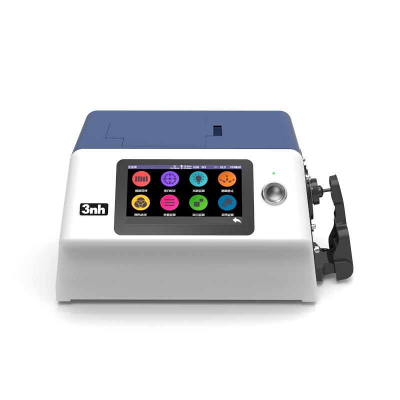
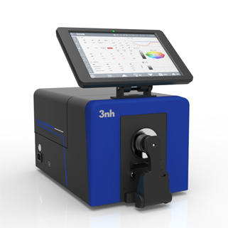
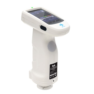
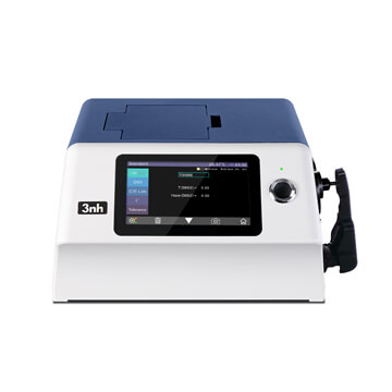
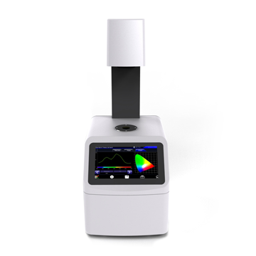
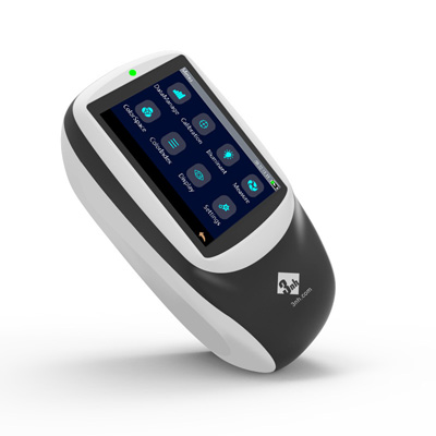
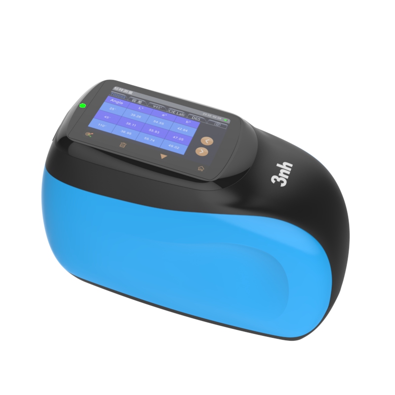
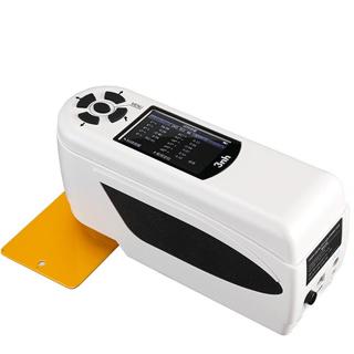
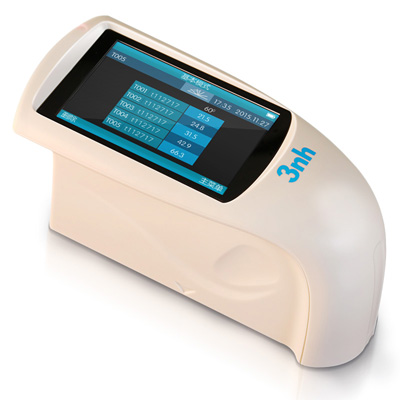
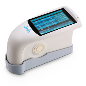
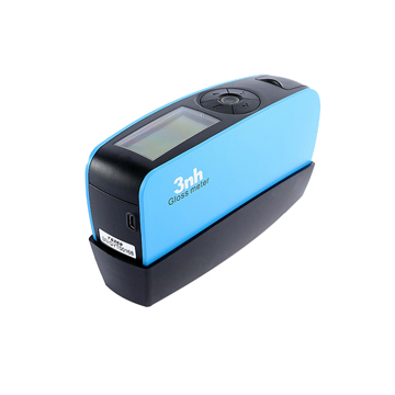
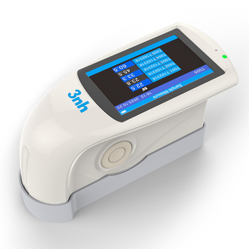
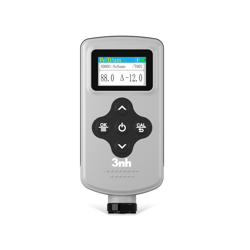
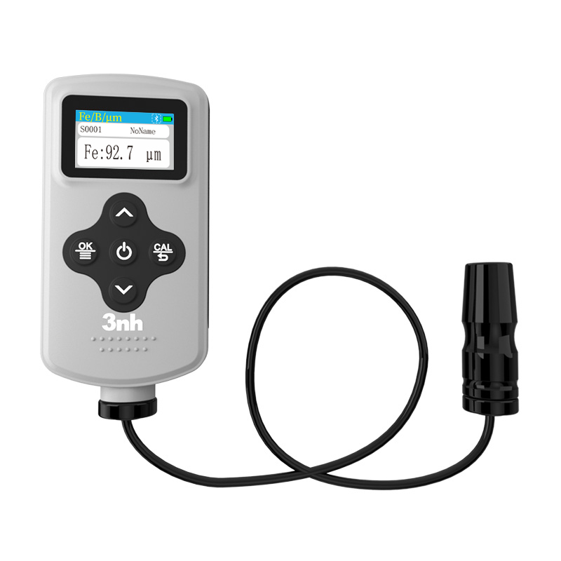
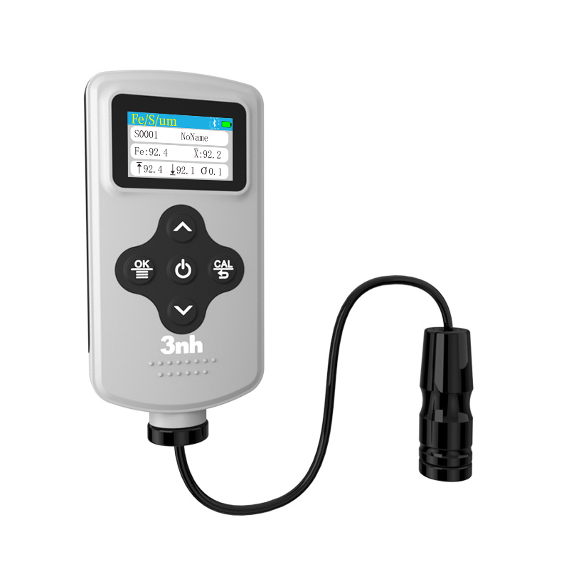
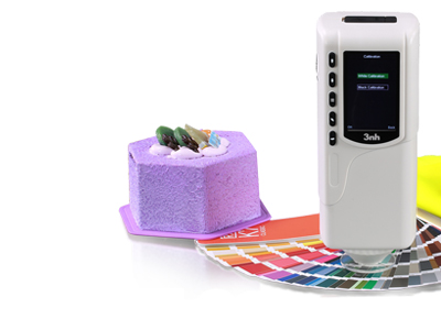
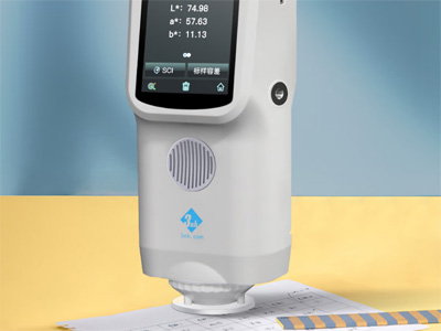
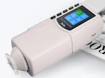
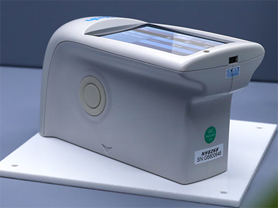
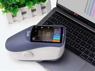
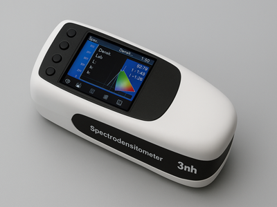
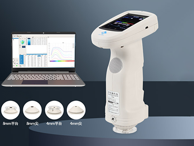
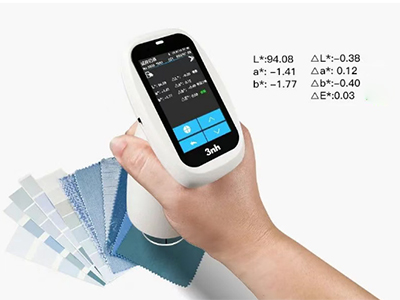
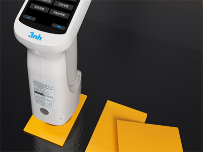
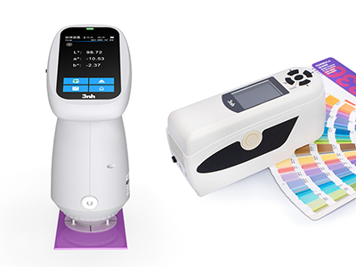
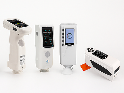
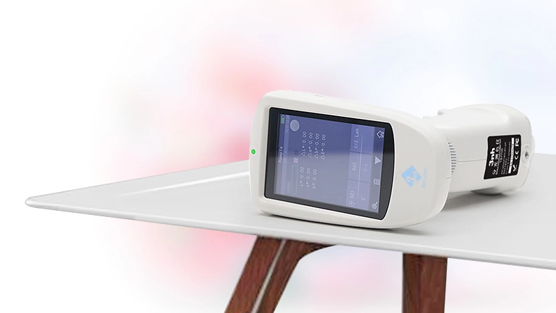
색상 측정 장치 제품 목록, 광범위한 색상 미터, 3NH 색상 측정 장치는 산업 전체에서 정확한 색상 탐지, 분석 및 품질 관리를 위해 설계된 고성능 도구입니다.고급 광학 센서와 지능형 데이터 처리 기술을 갖추고 있습니다.

-
연락처
3NH는 자동차, 직물 및 의류, 인쇄 및 종이, 플라스틱, 회화 및 코팅, 건설 재료, 화학 및 제약, 화장품, 식품 및 농업 산업에 국제 유통 네트워크를 적극적으로 확장하고 있습니다.우리는 기술적으로 능력이 있고, 헌신적이고, 장기적 성공을 함께 구축하고 싶은 성장 지향적인 파트너를 찾고 있습니다.