In the textile production process, color consistency is a complex and easily affected by a variety of factors, and color testing and management is the core to ensure product quality and consistency.
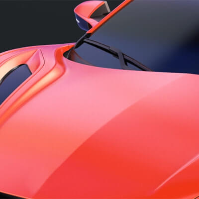
In automotive manufacturing and automotive parts manufacturing, color consistency and accuracy is critical because it directly affects the appearance of the vehicle, brand image and customer satisfaction.
In the plastics industry, color measurement is crucial, mainly in ensuring product consistency, maintaining brand image, strengthening quality control and enhancing customer satisfaction.
Color management in coatings is key to maintaining product quality and competitiveness in the marketplace.
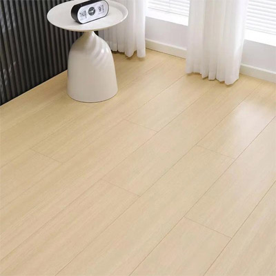
Ensure Accurate Color in Building Materials Solutions; Color management in the building and decorative materials industry is crucial for ensuring the aesthetic appeal, consistency, and market competitiveness of products.
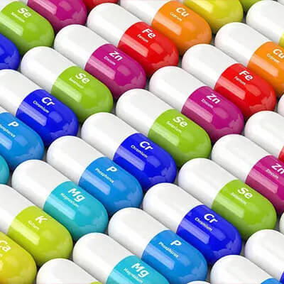
Color management of medical materials is key to ensuring product functionality and safety.
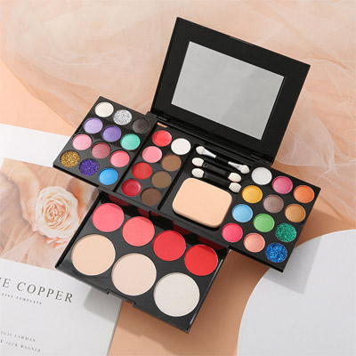
In the cosmetics industry, color testing is key to ensuring product quality and brand image, and is critical to product development and market performance,3nh Provides Services In cosmetic Color Measurement, China leader in color management, measurement, and control, offers cosmetic spectrophotometers, densitometers, colorimeters, and color measurement software.
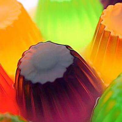
Color testing plays a key role in the produce and food industry because color not only affects the appearance and attractiveness of a product, but also reflects its quality and freshness.
The importance of management in the packaging, printing and paper products industry is reflected in several key areas. 3nh Provides Services In Printing Color Measurement, 3nh is the China leader in color management, measurement, and control, offers printing spectrophotometers, densitometers, colorimeters, and color measurement software.
Imaging Test Laboratory Solutions, Sine Image’s customized imaging test laboratory is equipped with wide-angle test light boxes, 7 sets of fixed color temperature test light boxes, various test charts (such as skin tone test charts, resolution test charts, distortion test charts, real-scene subjective test charts, etc.), chart holders, fill lights, and other equipment. Its testing solutions and products are widely used in industries such as security monitoring, automotive imaging, photography, medical imaging, televisions and computers, mobile phones, and drones for image quality inspection.
Frequently Asked Question about Appearance&Color Measuring Instruments, On this page you will find a few frequently asked questions and tips that are relevant for the vast majority of our Measurement Instruments equipment. Do you have a question about products from Threenh?
Catalogues, Brochures, Flyers, Certificates, Technical information and more; Any document requirement please download here to achieve well understanding for colorimeters, Color Spectrophotometer, Gloss Meter, Color assessment cabinet products, Threenh Technology is a precision instrument company dedicated to research and development, production, sales, and technical services.
IQstest is an image testing software developedby 3nh‘s SINE IMAGE company, Have many yearsof experience in image inspection, supporting Resolution Charts、ComprehensiveCharts、Dynamic Range Charts、Gray Step Charts、Distortion Charts、ColorChecker、White、Balance Charts、Fov Charts、Custom Charts.
PeColor Color matching software, Focusing on the overall color solution, A spectrophotometer +PeColor, Make color matching so easy!
Threenh offers you quality after-sales service . Need troubleshooting, repairs, or a maintenance contract? Contact our teams! 3NH Warranty Terms; Guangdong Threenh Technology Co., Ltd. (hereinafter referred to as “3NH”) provides a limited period of warranty service to clients (hereinafter referred to as “client”) who have purchased products manufactured by 3NH (hereinafter referred to as “Product”) in accordance with the terms of this Warranty Policy (hereinafter referred to as “3NH”).
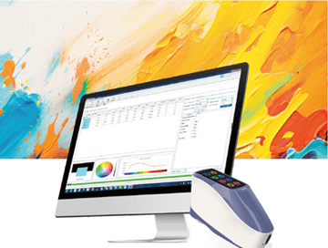
3nh offers a variety of color quality control software solutions. Below are some common software programs and their relevant information: Here is the introduction to 3nh‘s quality control software
Equip your team with affordable high-performance corlorimeter and spectrophotometer devices customized to your unique business. According to client’s demand to provide personalized ODM design & services, helping clients to enhance their brand’s competion advantage. Freely customize your instrument now!
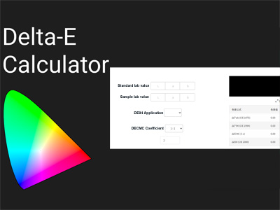
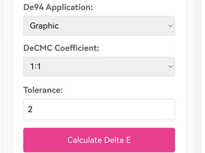
It includes converting the CIE Lab values of the standard color and the sample color. This tool allows you to find the right color difference by adding numbers into the CIEDE2000 formula (CIE 2000) after entering these values.
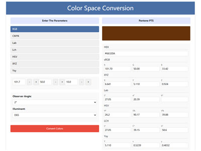
Free Color Converter: One-Click Color Transformation, RGB CMYK HEX Lab Lch HSV XYZ One Click Conversion, Professional Color Space Tools, Easily Convert RGB CMYK HEX Lab Lch HSV XYZ to Pantone (PMS) – Try Our Tool, Simple Accurate Conversion color Space with Our Converter
3NH Company News Center, News and Events, Exciting Developments,our news center serves as a dynamic hub of the latest happenings and developments within the company and the industry we thrive in. Here, you will gain exclusive insights into our continuous pursuit of innovation and excellence. Color Management Leader 3NH The Latest News
The Latest Product News from the Leaders in Color Management, Stay up-to-date with all the latest news from Threenh ! Discover our latest innovations, recruitment announcements, new products, press releases, and more.
Discover the latest tech news and measurement products from threenh technology. Shop innovative tech solutions or measurement instruments for your business now! No matter what you want to measure, we have done the groundwork to help you find the right color measurement tool.
Get essential Basic color Knowledge with threenh Technolgy. Explore smart solutions for your business needs. Contact us today! Here is where you will find upcoming color tech and startup events around the world.
3NH Industry News Center, News and Events, Exciting Developments,our News Center serves as a dynamic hub of the latest happenings and developments within the industry we thrive in. Here, you will gain exclusive insights into our continuous pursuit of innovation and excellence. Enhance your understanding of color testing and precise quality control indistinct applications
Embark on a virtual journey through our state-of-the-art manufacturing facility. Witness the precision and efficiency of our production lines as they bring to life our high-quality instrumentations and other advanced products.
Provide solutions to different markets by delivering a complete range of measurement instrument Products and ODM Services to our customers. From meticulous material sourcing to precise assembly and strict quality inspections, every step is carefully orchestrated to ensure efficiency, consistency, and compliance with international standards.
Account Name: Guangdong ThreeNH Technology Co., Ltd.
Account NO: 6652 7828 9156
Bank Name: BANK OF CHINA LIMITED GUANGZHOU ZENGCHENG SHITAN SUB-BRANCH
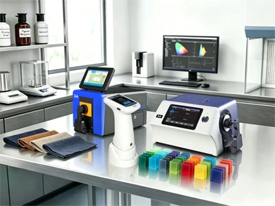
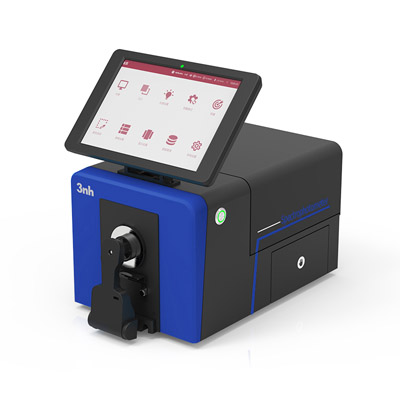
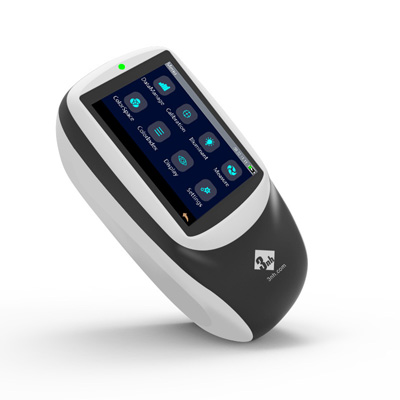
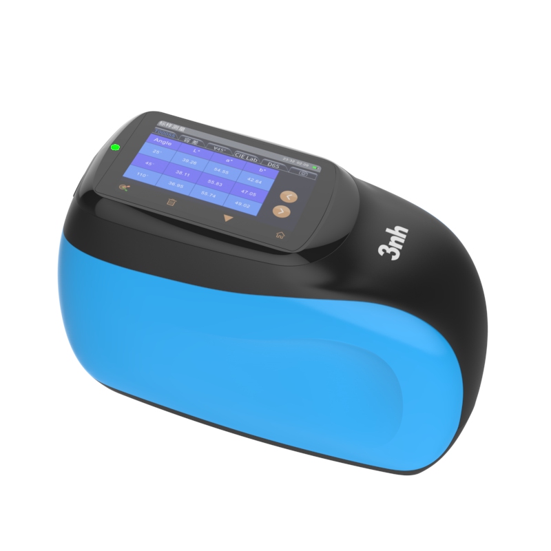
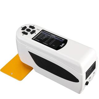
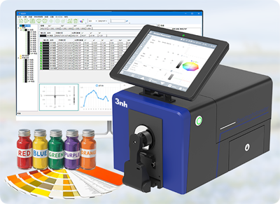
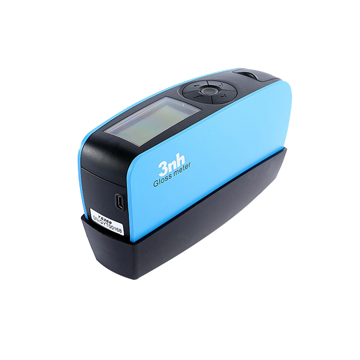
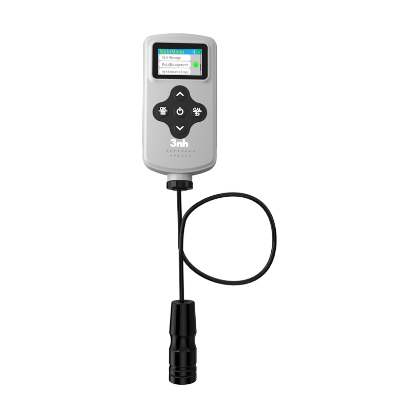
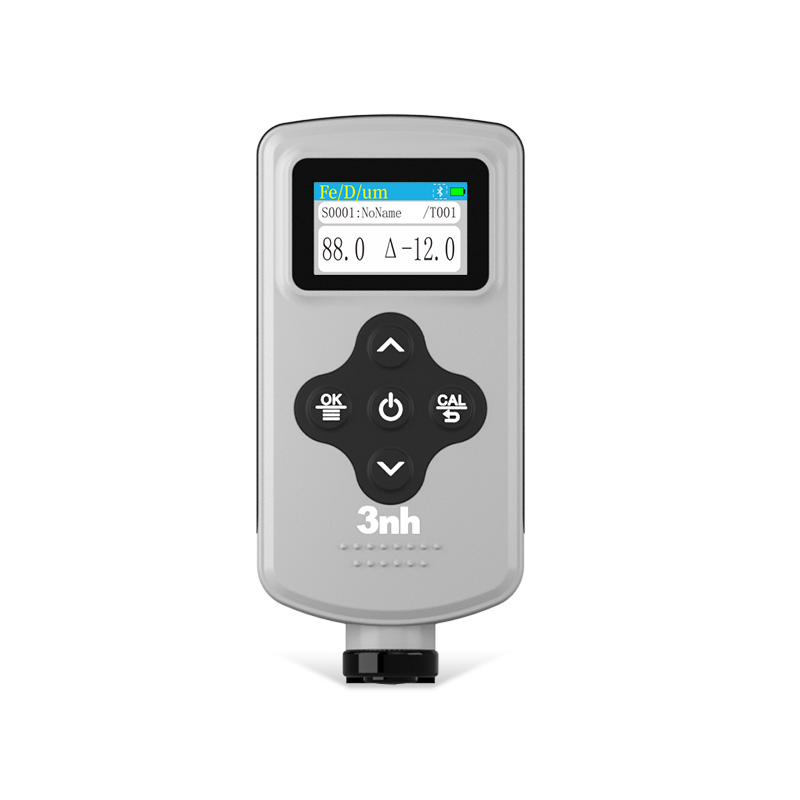
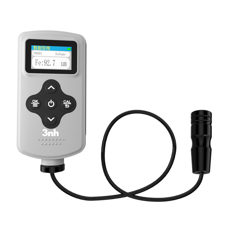
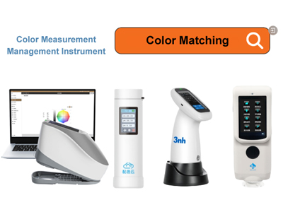
Color Measurement Devices Products List, wide range of color meters, 3NH Color Measurement Devices are a series of high-performance tools designed for precise color detection, analysis, and quality control across industries. Equipped with advanced optical sensors and intelligent data processing technology
3NH is actively expanding its international distributor network across the Automotives, Textiles and Apparel, Printing& Paper, Plastics, Painting and Coating, Building Materials, Chemical&Pharmaceuticals, Cosmetics, Food and Agricultural industries. We are looking for technically capable, committed, and growth-oriented partners who want to build long-term success together.
Long ago, folks realized that white light, like sunlight, divides into separate colors when passing through a prism. A prism shows the seven colors of the rainbow: red, orange, yellow, green, blue, indigo, and violet. Each color is a different wavelength. Red light has the longest wavelength, violet light has the shortest, and the colors between each have different wavelengths. You can see this in the figure below.
If the colored light that comes from white light passes through a prism a second time, it will not continue splitting into many other colors. This type of light that cannot split any further is called monochromatic light. The monochromatic light's color can also change depending on the frequency or wavelength. Both can be converted with the formula c = (lambda)f. Light that is made from monochromatic color is called composite light. The color of composite light is determined from the frequency of the light that contains the most energy. If composite light contains all the visible light, then it will be white.
Many kinds of glass and other optical media have their parameters related to the frequency of light. They will have different refractive indices for light of various frequencies, and the speed of light will change as well. Both of these situations can be called the dispersion of light.
The visible spectrum is formed from the dispersion of light through a prism. The dispersion of light in a fiber-optic cable also extends the wave packet, which, in turn, limits the speed at which the signal can be sent. People can see colors because different objects release light in different colors, and our eyes see and interpret that light.
These different colors, or photons, enter our eye and are absorbed in the retina. Once absorbed, these photons are turned into electrical signals. These signals travel through the optic nerve to the brain so that the brain can interpret them. Then we 'see' something.
We know that light is an electromagnetic wave. This is the same electromagnetic radiation that cell phones, microwave ovens, and X-ray machines emit, just at different frequencies. The radiation that we see and that triggers our photoreceptors is called light, and is in the 380-760 nm wavelength. The visible light spectrum is just a tiny part of the electromagnetic spectrum, as shown in the figure provided.
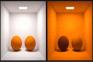
The most essential part of an object’s color is how the light reflects and absorbs. For instance, white light passes through the copper sulfate solution and the copper ions absorbs part of the yellow light and is left with the blue light and is why the solution looks blue. However, if the copper sulfate solution is shining yellow light, the copper sulfate solution does not appear blue, but black.
This shows that the light source color plays a key part in determining color. When there is no light shining in a certain area of the spectrum, the visible color will also go down.
For color observation, the most ideal light source is the sun. As seen below, sunlight is the ideal light source for color observation. The spectrum of sunlight in the visible range is continuous and flat.
Electrons that orbit at higher energy levels than the rest can drop to lower levels. When an electron does this, it releases light in the form of a photon. If an electron is sitting in a lower energy level and wants to jump to a higher level, it must take in energy (heat) equal to the energy gap in between the levels.
Electrons at the higher energy levels are not stable. Eventually, they jump down to lower levels, releasing a photon in the process.
In the figure below, one can see the energy level diagram of the hydrogen atom and its spectrum.
(a) Energy level orbits (b) Emission spectrum (c) Absorption spectrum
As seen in the above figure, in the emission spectrum (b), when the electrons go from high energy levels to low energy levels, they release energy in the form of photons in the spectrum. In the absorption spectrum (c), a continuous spectrum light source is passed through hydrogen gas, where electrons absorb photons of certain wavelengths, producing gaps in the continuous spectrum.
Some substances, like the halogen group of elements, have energy levels that are excited far more easily, so they are the ones typically utilized to generate artificial light. The light energy that such chemicals release is typically focused on a few spaced wavelengths.
The spectrum of a metal halide lamp is shown in the figure below. From the spectrum, it is easy to see that the wavelength at which the energy is the most concentrated is 591 nanometers, which corresponds to a yellow-green light.
The most common type of fluorescent lamp is the one that uses mercury vapor as the luminescent material. The spectrum corresponding to the mercury atoms is shown in the figure below.
Human Vision
The human visual system (HVS) possesses three types of cones designed to respond to long, medium, and short wavelength of visible light. The figure below depicts the frequency response of the three cones to one identical light stimulus.
Since HVS only has three physical color detectors, the nervous system extrapolates color perception for human colors through color interpolation. For any color perception, there are an infinite number of spectral forms that could possibly stimulate that.
For instance, considering the four instances depicted in the low figure, from top to bottom, are
(a) A continuous spectrum of daylight
(b) A discrete spectrum of red, green and blue,
(c) A discrete spectrum of yellow and blue
(d) A spectrum of fluorescence.
Experimentation has indicated that any of the four types of lights, as hypothesized, to the human eye all appear to be white. This leads one to think that the HVS is not overly worried about the actual particular spectral composition of the light source.
An ideal black body (sun) emits a continuous spectrum, and its spectral power distribution is a function of temperature, that is, of its color temperature. In cases (b) to (d) of the above figure, the spectrum lines are discrete and so do not meet the definition of color temperature.
This is where the idea of correlated color temperature (CCT) was introduced. If any light source stimulates the same color perception as a black body of color temperature T, the correlated color temperature of that light source is T.
Correlated color temperature is a phenomenon that DB Judd is credited with first describing in 1936. It is defined in terms of color temperature and isotherms. Each color isotherm has a single value of correlated color temperature. The following are recommendations for isotherms from DB Judd that have been included in the CIE 1960 UCS uniform color space standard described in the following text.
For the human eye, the color of a beam of light is dependent on its frequency, and its energy is what determines how visually stimulating the light is. The human eye perceives the same color when looking at two beams of light of the same frequency, but if one beam has more energy, it will be a brighter color.
The white curve in the image below shows the spectral response of Sensitive to Short Waves S Cone in the Human Eye. The black solid dot curve shows the discomfort of young people in their twenties to equal power glare. The black hollow dot curve shows the discomfort of people around sixty years of equal power glare.
Research shows that all people are more sensitive to blue glare. People tend to experience pain due to the blue light component in the bright high-beam headlights.
LED light source
Led light source means light emitting diode. The most common high powered led that is pretty much everywhere is the one that emits blue light at a peak wavelength of 460nm. To achieve a white light source, a phosphor additive is used which absorbs the blue light and emits yellow-green light in order to change the color tone and modulate the color temperature to either cool white or warm white.
6650K cool white light
2875K warm white light
The below example shows that the spectral components (color temperature) significantly influence the quality of the photography.
Nature of the light source
Every light source has some sort of physical property that describes how much light that source is emitting and in what direction, and that physical property is called luminous intensity. The luminous intensity is measured in candelas. The term “candela" is derived from the word candle. The original definition of the unit taught in schools in the UK was how much light is emitted from a candle, specifically a one pound, foot long white candle, with the flame on it. Over the years, the definition has transformed.
For example, the definition that was adopted by the 16th International Conference on Weights and Measures in 1979 states, "the luminous intensity of a light source is 1 cd in a particular direction, If, in that direction, the radiation is 1/683 watt/steradian, emitted by a monochromatic light source of frequency 540 x 10^12 Hz.”
Note 1: 1 Watt/steradian means that in a given solid angle, 1 joule of radiation is emitted every second.
Note 2: One of the SI units of solid angle is steradian which has the abbreviation "sr". The solid angle of a complete sphere is 4u03C0 which is sr, around any specific point on that sphere.
If light is needed and there is a light source, measuring only the radiant power isn’t enough. One has to look at how the human eye responds to light at different wavelengths.
The advent of the term ‘luminous flux’ made this clearer.
In the 1970s, the International Commission on Illumination CiE came to the conclusion that the human eye is most sensitive to 555nm monochromatic light in photopic vision and set this value as the reference wavelength for converting ’power’ into ‘luminous flux’ and thus 1W of 555nm monochromatic light was defined as 683lm of luminous flux.
‘Lumen’ (used symbolically as ‘lm’ in English) is the unit of luminous flux. As for why it is 683, it has to do with the early days of describing light with candles.
From the definition of luminous intensity, we see that for an isotropic light source with a radiant intensity of 1cd, the complete radiant flux in a solid angle of 4π is 12.57lm
The energy is referred to per one photon of light having a wavelength of 555nm.
At 1 lux illumination (1 lm/m2), how many photons are passing through a 1 sq. meter are illuminated for one second?
Illuminance refers to how much light shine directly onto a surface area. Specifically, metric of how much light shine on surface area is luminous flux per unit area which is measured in lumens per square meter (lm/m2) radially. This measure is called lux (lx) for short. The measurement of light is called 1 lux or 1 lumen per square meter, which is light source emitting one candle. This means that one lighted surface is illuminated one meter.
Luminance refers to how much a brightly surface is. Specifically this measure is radian flux per unit area of luminous in one direction and per solid angle. This measure is called nit, which is radian per square meter per steradian also called luminous cd/m2.
Note 1: The m2 in luminous cd/m2 means the surface area of the luminous surface itself.
Note 2: The term brightness is sometimes referred to illuminance.
Note 3: "Light Intensity" is an informal and ambiguous term. In some instances, "light intensity" can mean luminous intensity, or even, illuminance or brightness.
Lambert, is a unit of measurement luminance of the
Centimeter-gram-second system, is said to be the luminance of a fully diffusing surface that emits or reflects one luman per square centimeter.
The questionnaire measures the purity of a light source by the spectral purity of the light. Monochromatic light exhibits the most purity, whereas incoherent light is said to be white and has the least purity.
Three primary colors
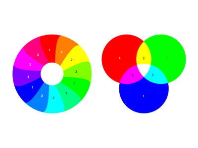
People perform color mixing experiments where it has been established that the majority of colors in nature can be achieved by sampling three specific monochromatic colors and mixing them in a definite proportion. These three monochromatic lights that have this trait are known as primary colors, whereas the respective three colors are also referred to as primary, for example, red, green, and blue.
The fundamentals of color mixing
Different uses give different meanings to the three primary colors. For now, there are mostly the following groups: par extbf{Three primary colors of light} par In 1931, the International Commission on Illumination (CIE) defined the components of the mercury spectrum at 700nm, 546.1nm and 435.8nm as the three primary colors of red, green, and blue.
CIE prescribes that red light with luminous flux of 1 watt is a red primary color unit, green light with luminous flux of 4.5907 is a green primary color unit, blue light with luminous flux of 0.0601 is a blue primary color unit and they are recorded as: [R], [G], and [B]. These three can be mixed in certain amounts to get other colors.
When you mix the three different primary colors together, you should get white light. E white light is the equal-energy white light at point E from the CIE 1931 xyY color spectrum, and has a color temperature of 5400K.
F(E white) = 1 + 4.5907 + 0.0601 = 5.6508 (lm)
Three primary colors of color television
A color TV has a fluorescent screen coated with three different phosphors. When the screen is hit by the aimed electron beam, the screen can emit red, green, or blue. By mixing the three primary colors in unbalanced amounts and different intensities, many colors that exist in nature can be created.
Pigment: three primary colors
The three primary colors of pigments and other nonlight sources are magenta (rose red, pink), magenta cyan (darker sky blue, lake blue), and light yellow (lemon yellow). The three primary colors chosen by the British chemist Fulbright (1781-1868) can be combined to generate a wide range of colors, but can’t make black; only a dark gray can be created. This is why in color printing, in addition to the three primary colors, a black is also needed to get rich colors.
It’s common knowledge that adding yellow to magenta creates a bright red (red= M100 + Y100). But once a bright red is made, it can’t be used to make magenta. It takes cyan and a little bit of magenta to make a blue (blue= C100 + M100) and that blue can be diluted to a dull cyan using white.
Printing the Three Primary Colors
Color has to do with the lightที่t reflects off the paper. It resembles the colors and the mixing of colors in painting. Pigments light absorption is different. The primary colors of pigments absorb the three wavelengths of RGB light. Through research, cyan, magenta, and yellow (CMY) were determined to be the primary colors since they are the RGB of the complementary colors.
When yellow and cyan pigments are mixed, the yellow pigment absorbs blue light while the cyan pigment absorbs red light, reflecting only green light. Hence yellow and cyan pigments together produce green color.
Color model
A color model is an abstract representation of colors that eases the recording and retrieval of color information. A common color model is of three to four dimensions. In case the color model is further constrained, such that the values defined in the model are actually mappable to real colors, the colors that the color model can represent are then fully determined, thus creating a color space.
When discussing Color Theory professional's will of course refer to it as a Color Model, but that is not entirely accurate. Major theorists will define the difference that should be noted. S RGB is a color space using the RGB color model where the colors correlate to where the three primary colors R, G, and B are located on a color grid, and certain limitations are put on the conditions (brightness range) to be able to see the colors.
This is to ensure that the RGB color model can be accurately and consistently (over and over) aligned to colors. Depending on the Device (DST) with the proper sRGB color surround, images can be repurposed and with the same color effect.
Common color models
Every color display system can render a certain range of colors, known as a color gamut. It is important to remember that the concept of color gamut can only be applied to color rendering systems, such as display monitors and printers. For color measuring systems, such as cameras and spectrometers, there is only color response and not color gamut.
Nonetheless, quite a lot of camera so-called manufacturers also try to relate the RGB value output by the camera/sensor to a certain color gamut. In this case, the RGB code should be directly related to a certain color point within the color gamut. If a color output from a different color gamut is used, the displayed color of the system will be different from the intended color.
When the intended display system does not possess the color gamut defined by the camera manufacturer, the color will not be displayed properly. In such a case, you are first supposed to map the camera's RGB to a standard color space, such as, XYZ, and then display it by using the XYZ values when converting the RGB of the display to the XYZ values.
Camera makers pick this method because sensors capture a wider range of colors than sRGB, which regular displays show. Having a larger target color range when recording minimizes the loss of original color information and keeps enough for possible color adjustment later in the video editing process.
RGB color space
RGB is the most popular color space in computer science, as shown in the image below.
For most common 24 bit 3 channel color digital images, each pixel (x, y) can be represented by 3 elements: R, G, and, and B. Each is a byte, which is 0, 255.
RGB is the name of the color mode that almost every screen outputs. This was because the color representation of the screen output was much more closely related to how humans actually see color than every other color mode. This is color composite cathode ray tubes and color raster graphics displays that use RGB to drive R, G, and B electron guns. They fire electrons to ignite the R, G, and B phosphors on the screen so the screen can produce different colors.
When a scanner scans a color original, it reflects and samples the R, G, and B components of the light and it is the R, G, and B ports of the scanner that ascertain and record the original color.
Because different scanners produce different color data from the same image, and different monitor models display the same image in different color ways, the RGB color space is called a device-dependent color space. Also, the RGB space in monitors and scanners does not align with the CIE 1931 RGB which is a true 3 primary color system. This is why it is called a device independent color space.
YUV, YCbCr color space
YUV refers to a certain kind of signal. It was initially applied in color television systems PAL and SECAM that were engineered in Germany and France, and it is now applied in computer systems as well.
Luma (Luminance) stands for brightness, and U and V represent color and color comcentration (Chrominance and Chroma). YCbCr is a lossy color space. It is a variant of YUV and is used more frequently than YUV in certain areas.
It is used in real-time video processing in films or systems for digitized photography. This format is used for JPEG, MPEG, DVD, and even digital television and cameras. That is why most people refer to YCbCr as YUV.
Y in YCbCr means the same thing as it does in YUV. Cb and Cr are colors that correspond to U and V, and Cb stands for blue chromaticity and Cr stands for red.
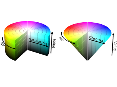
HSV color space
Because the color space is simple to use, it is found in many different programs people use to edit images. The color space in these programs uses the three parameters, hue, saturation, and value.
Hue H is one of the three main values of the HSV color model, indicating the color's shades, component ranges from 0 to 359 degrees, where 0 is red, 120 is green, and 240 is blue. To differentiate each primary color from each other, each primary color has its own complementary color, which is H = 60 for yellow, H = 180 for cyan, H = 300 for magenta.
The second most important S is Saturation, an indicator of how far from one hue the color becomes of the addition of the lightened component H to the spectral color. The more H extraction, the bluer the color. Principal saturation values bounds are usually from 0, for a color with the spectral component absent, to 100 for a fully saturated color. A color where saturation is higher is a shade which is the addition of the indicated hue to a lighter component, usually white.
The third most important value to the the color is Brightness, which is usually in the percentage range of. 0 for pure black, and 100% for pure white. This component is usually the most difficult to model in. The light of any object should change depending on the color of the light for which the object is a light source. This object also has a color.
CIE-1931 RGB color space
In 1931, the International Commission of Illumination (CIE) proposed the RGB color model. Almost immediately, though, the CIE model was found to contain design faults. Specifically, the model included negative values in the red response of the 435.1~546.1 band, leading to difficulties in color matching, as shown in the figure below.
CIE promptly attempted to correct the problem with a modified version of their color model. But since the initial RGB name was inuse, their modified version was called the XYZ color space.
CIE-1931 XYZ color space
In 1931, the International Commission of Illumination (CIE) was the first to, in a purely mathematical manner, define a color space model (CIE 1931 XYZ color space) that contains all the colors that the human eye can see, without anchoring to any color implementation. Thus, whenever a color is displayed in the standard XYZ format, it can be reproduced by any compatible display, and regardless of the underlying characteristics of the display, the color shown will be the same.
In the model, CIE proposed three functions that would replicate the response curves of the 3 classes of cone cells in the human eye to the visible spectrum, as shown below.
CIE sets some functions based on a data table. This data subset is considered the CIE standard observer response function. This data is used for angles of observation of less than 2 degrees.
The 2 degrees is based on Wright, Guild, and others conducting a research study on the Color Matching Function (CMF) during the 1920’s. Subjects were asked to view colors through a small peephole that provided a 2 degree field of view. Much later, CIE published another standard observer response, but with a 10 degree view, named CIE 1964 10 degree RGB CMF.
Let’s say the power spectrum of some color light is S(λ), then the CIE XYZ tristimulus value is determined by standard observer response function as follows:
When it comes to numerical calculations, the dλ is usually taken to be 5 or 10 nanometers.
When the color light gets reflected off the surface of an object, S(λ) is determined by the illumination source and the surface of the object’s reflectivity. Below is a more detailed example.
The XYZ coordinates contain the light source’s energy information, meaning that there is no bound to the value, as shown in the image below.
CIE-1931 xyY color space
A slightly different, and possibly more helpful, approach can be taken when chromaticity is examined. From the CIE tristimulus values_normalized, the values can be categorized into three orthogonal types - x, y, and z.
Out of these, x and y show the chromaticity of the color, and the Y value of the tristimulus values shows the color's brightness (luminance). This space is called CIE xyY.
The definition of the CIE xyY color space is based on the fact that for any color, when the brightness is adjusted, the luminous flux for all the primary colors needs to be uniformly increased. Thus, the proportion of X to Y to Z can be held constant and the color can be matched.
This chromaticity value is only dependent of only the wavelength (hue) and the purity, and is independent to the total radiant energy. Therefore, when chromaticity of the color is calculated, X, Y, and Z can be divided by the total radiant energy (X+Y+Z), or, equivalently, only the case of the X+Y+Z=1 section can be considered, and the color matching equation can be shortened to x+y+z=1. Therefore, to show the color, only x and y should be expressed as z can be calculated from x+y+z=1.
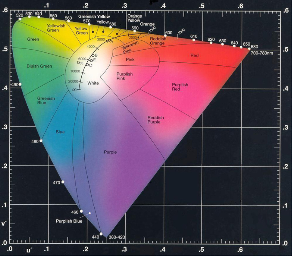
The picture below shows the well-known CIE chromaticity diagram, usually called the horseshoe or tongue diagram.
The outer edge of the chromaticity diagram has a tongue-shaped curve, which is called the spectral locus, and the number next to it shows the wavelength of the spectrum in nanometers. The straight line at the bottom, which connects the two points of 380nm and 700nm, is called purple line. The colors become less saturated as they move outward, and they end at a special point E at the center of the graph. This center point is known as the equal-energy white-light point. This point has coordinates (0.33, 0.33) and a color temperature of 5400K.
In the diagram, the segment of the spectrum is colored red if it is in the area where the x coordinate is large. In the area where the y coordinate is large, it is colored green, and in the area where both coordinates are small (therefore, the z coordinate is large), it is colored blue.
The chromaticity diagram also includes a feature called the blackbody locus (or Planckian locus), which has a concave shape. This curve has no endpoints, but contains a few ”special” points. These special points include:
Point A (an incandescent lamp, or at 2856K) and Point B (previously recommended as the daylight standard, at 4874K, but now replaced by point D.
Point C (6774K) shows the skylight on a cloudy day.
Point D (6500K) shows the daylight.
Point E shows the equal-energy white light point, an ideal standard which does not exist.
Just to note: the color temperature trajectory scale is uneven, on account of which there’s been a factor-of-ten shift at both ends of the curve.
The spectra which correspond to the special points, each with their own point, are illustrated in the figure below.
The following figure shows the projection of the RGB space in relation to the XYZ space. Here, as the figure shows, there are a lot of the colors which the human eye is able to see, but they're not in the RGB color space. Accordingly, not every color which the human eye can see is contained in the RGB space.
Color Wide Capacity
Each point on the xy chromaticity diagram represents a certain color, but the human eye cannot distinguish two points when they are too close together. The range of wavelengths that people cannot see is called the color bandwidth. The research by Mac Adam et al. demonstrates that the color bandwidth is different at different locations in the chromaticity diagram, which is illustrated in the figure below (the ellipse is magnified by a factor of 10 to improve the display).
An important conclusion from the Mac Adam experiment is that the distance between any two color points on the chromaticity diagram is not linearly related to the chromaticity difference that the human eye can see.
Perceived homogeneous space
A color space is said to be perceptually uniform if a difference of some amount at any point in the color space corresponds to a difference of that same amount in any other point in the space.
Let's assume that there is a color space that has a unit change in color value, no matter where in space it is, the same unit change leads to the same perceptual change. This color space is called perceptually uniform. Such a perceptually uniform space has the same color bandwidth throughout it, no matter what the color value is. This can be seen in the image below.
For the space Z= ∫xyY, it can be seen that space is perceptually non-uniform. This leads us to ask, is there a metric that is linearly related to the human perceptual visual response? Yes, it is probable with the micro reciprocal.
Micro-reciprocal
Color bandwidth, also referred to as perceptual uniformity E, is determined by how color temperature, T, responds to the empirical functions Judd quantified JND to be, T. This mitigated color temperature was concordantly supplemented with a formula that, can be expressed as empirical with the given constraints.
This produces the following metric.
Let component function M(T)= 1E6/T so that dM/dT=−1E6/T^2. Filling in to the formula will yield the linear expression M, E.
This leads us to conclude M is the Micro Reciprocal Degree of color temperature. This particular unit is color temperature expressed in mired, MK^-1. This can be interpreted to mean the smallest discernible difference of the human eye is 5.5 mireds.
For instance, looking at a temperature of 5000 Kelvin (K), the semi-inverse value is 200 mireds (M), while the next distinguishable temperature is 4866K (M=205.5), so the interval of temperature is 134K. Looking at a temperature of 2000K, the semi-inverse value is 500M, while the next distinct color temperature is 1978K (M=505.5), so the interval of color temperature is 22K.
This example demonstrates the point that the human eye is more capable of distinguishing low color temperatures.
In the next diagram the human color bandwidth at varying color temperatures is shown. Color Differences that lie within the ellipse cannot be distinguished by the human eye. For illustration the ellipse's radius is shown at 24 times the scale.
In the table that follows the temperature color points obtained and the micro-reciprocal in the previous figure are represented. It can be noted that with the micro-reciprocal coordinates, the points in the figure are equally distributed.
CIE-1960 UCS color space
One color space that can be improved is CIE-1931 XYZ. One flaw is that the error in some color intervals is positive while in other intervals the error is negative. In 1960, CIE proposed a way of representing color differences more uniformly. In dimensional transformations, Mac Adam converted 1937 (x, y) coordinates into (u, v) coordinates:
u = 4x/(-2x + 12y + 3)
v = 6y/(-2x + 12y+ 3)
represented more generally as,
Planck locus, isotherms and primary color temperature coordinates on CIE-1960 UV chromaticity diagram.
At the color temperature denoted T, the slope of the line segment on the Planckian locus is:
in
The slope of the line that is parallel to the isotherm is mathematically expressed in terms of the slope of the tangent line, as being the negative of the reciprocal of the slope of the tangent line.
Calculating the correlated color temperature, known as CCT, of a point S(u, v) inside the chromaticity diagram can be done in a variety of ways including the interpolation, foot of the perpendicular, and many more methods.
(a) Interpolation method (b) Perpendicular method
This specific implementation process has been documented.
CIE-1976 UCS color space
Within the (u,v) color coordinate system, visual color synchronization remained elusive. Mac Adam continued his research to bring the expected visual perception closure to reality. In 1973, he decided to add 50% to the v coordinate. This system became the CIE 1976 UCS (Uniform Chromaticity Scale) color coordinate system:
u'=u=4x/(-2x+12y+3);
v'=1.5v=9y/(-2x+12y+3)
The CIE 1976 UCS made a conversion of CIE 1931 chromaticity coordinates such that the color gamut it formed was close to a uniform chromaticity space, thereby allowing color differences to be quantified. This became documented as the CIE LUV color space.
CIE-1976 UCS Planck curve partial enlargement
The distance Delta u'v'} in the (u',v') coordinate system representing color is directly proportional to the distance to the chromaticity it is perceived to hold.
By using the CIE 1964 and 1976 versions to locate the Munsell color sequence, it has been found that in the 1976 version, the color uniformity is better.
CIE-1976 L*a*b* color space
CIE L*a*b* is one of the color spaces that is most used and most versatile. It distances between color are more linear than other color spaces which align that color relationships more closely to the linear relationships found in and are more precise to the human perception of color, especially in the darkness of the color being described. The one very slight disadvantage is that closer to describing the color yellow, the linear relationships shift, meaning that the diameter of the color tolerance circle is smaller when describing yellow.
A large area of uniformity is spread evenly in color spaces which is similar to the CIE 1976 UCS. Although uniformity in these standards is not perfected, there is a large margin of these standards being used and an even greater margin of no example being provided. That being said, the figure provided below is CIELAB showing the sequencing of the Munsell color system whereby the distribution of some variants in the color systems becomes evident, especially the problematic blue.
The CIELAB color space does not very well address the hue constancy problem and cannot explain the color appearance phenomena known as the Hunt and Stevens effects. To resolve the issue of hue constancy, CIE proposed an interim standard in 1997 known as CIECAM97s, which was later on simplified and finally released in 2002 as the CIECAM02 standard to streamline the complexity of the model and enhance the accuracy of the standard.
The CIE L* a *b* color model of regional distribution is mathematically defined as follows
in,
In the above formula,
L* is the lightness of the color (0-100),
a* and b* is the chromaticity (-128 to 128), a* is the red-green axis (red, + / green, - ) and b* is the yellow-blue axis (yellow, + / blue, - ).
Xn, Yn, Zn are the XYZ values for the light source.
The formula above, utilizes a 1/3 exponential curve to replicate the logarithmic nature of human visual response, which in turn simplifies calculations.
To measure Euclidean distance in L*a*b* space:
in,
From a* and b* we can determine saturation C, which is also referred to as chroma, and a hue h:
To convert from L* a * b* space to XYZ space use the following:
in,
Neglecting the lightness L of the color and only considering chroma C we can define the color difference as ∆C:
It is commonly accepted that a color difference of 4 to 5 results in very good color quality, a difference of 5 to 6 results in relatively good color quality, and a difference above 10 results in poor color quality.
The figure below is a report by the Imatest software evaluating the color reproduction of the CCM matrix. The figure shows the theoretical and actual locations of each color point on the 24-color card in L*a*b* space and computes the mean color error. All 6 gray blocks on the 24-color card are located at the point where a=b=0.
The following code converts the XYZ values to the CIE LAB space. In a word, here is the code.
X = 19.4100; Y = 28.4100; Z = 11.5766;
Xn = 94.811; Yn = 100; Zn = 107.304;
if X/Xn > (6/29)^3
fx = (X/Xn)^(1/3);
else
fx = (841/108) * (X/Xn) + 4/29;
end
if Y/Yn > (6/29)^3
fy = (Y/Yn)^(1/3);
else
fy = (841/108) * (Y/Yn) + 4/29;
end
if Z/Zn > (6/29)^3
fz = (Z/Zn)^(1/3);
else
fz = (841/108) * (Z/Zn) + 4/29;
end
L = 116 * fy - 16;
a = 500 * (fx - fy);
b = 200 * (fy - fz);
The figure below shows the Munsell color marking system. In an ideal color space, a set of color points of the same hue should lie on a straight line.
However, the situation is not ideal in CIELAB space. When lightness or chroma changes, the color hue will shift.
Color picker and converter (RGB, HS, L HSB/HSV, CMY, K, HEX, LAB)
IPT color space
Hue constancy is an important property of color space. Compared with lightness and chromaticity, the hue law is more difficult to describe mathematically.
In the United States in the year 1988, while doing a PhD at the University of Rochester's Institute of Technology with his adviser Mark Fairchild, student Ebner suggested the IPT (? for Intensity, Protan, and Tritan) color model.
If IPT is to be converted to CIELAB the values of I, P, and T must be scaled. I must be multiplied by 100 and P and T must be multiplied by 150 then converted to the ranges which are I {-1 to 1}, P and T {-1 to 1}.
The IPT model's independence from CIELAB will work in terms of discrimination of achromatic and chromatic colors as well as in rank order of brightness. On the other hand, in the uniformity of the hue, IPT model's linear relationship with the blue hue is stronger in comparison to model CIELAB.
The IPT color model has also been the focus of a lot more debate. In teaching research, hue's line has been favorite. It talks about the line drawn from the origin of the color space in any of the directions and hints at the points in hue varying their saturation which led to the creation of the color space ICaCb.
Rec.709 color gamut
ITU Recommendations Also Called 709, BT 709, 709, and ITU709, and ITU 709, is the standard for HDTV color gamut and was set by the ITU in 1990. Displays that meet the HDTV standard must be able to reproduce all colors in this gamut. Rec. 709 Gamma Equation
Rec.709 Gamma Formula
AdobeRGB color space
This is a surprising result. Based on the statements made by employees of Adobe, Photoshop 5 was about to be released in the year 1998. To optimize the built-in color management mechanism of the software, engineer Thomas Knoll was interested in the BT color standard. 709, the SMPTE 240M standard, to find out the scope of color gamut. But because the standard was not available online, and Photoshop 5 was about to be released, they could not wait for a paper version to arrive in the mail, so Thomas found a set of SMPTE 240M data on a website that looked official and used it for Photoshop.
After the program was launched, it received a lot of positive reviews. The general opinion of the users was that the new configuration of SMPTE 240M is quite satisfactory in terms of the color gamut and the ease of transition from one color system to another in the CMYK color system, which is the strong disadvantage of sRGB. As a result, many publications began to recommend the SMPTE 240M color gamut standard which is used by Adobe.
But then, an individual knowledgeable about the SMPTE 240M standard also noticed mistakes in the version that Adobe included in Photoshop; it was not even the color gamut value specified in SMPTE 240M, but rather an "ideal value" in the annex of the standard. To add insult to injury, Thomas had a typo when setting the red coordinate, and that value was not even the same as the "ideal value" in the annex.
When Adobe learned about the mistakes, Adobe employed a number of strategies to fix the issue, and even though they put in a lot of effort, the upper bound of the color gamut standard that was set as a result of this incident was unassailable. Ultimately, in order to avoid trademark and legal complications, Adobe stopped attempting to fix the "mistake" and proceeded to call it Adobe RGB.
Adobe RGB mostly solves the issue of discrepancy in color between print and display and enhances the cyan and green. Coverage of the CIE color gamut increases up to 50%. To this day, only a small number of expensive monitors will display 99% of the Adobe RGB color gamut, and they are mostly used in fields of professional design.
Color space sRGB sRGB are Microsoft and HP 1996 started colorization and it is also colorization widely colorization by colorization industries. Monitors and colorization graphic computer softwares and vido games and also picture and vido are colorization sRGB are colorization standards. Computer sRGB are colorization monitor are able to 95% support and be colorization space sRGB.
Colorization space sRGB lacks of colorization standard and very colorization of technologies and also colorization concepts are of computers colorization. sRGB covers 30% of CIE box standard and and very low colorization. sRGB standard color is sRGB low lacks. Monitors 100% of sRGB standard also able computers are applicable to.
AdobeRGB was proposed in 1998. It has greater range in color coverage than rgb color space and has greater support for cmky printers. It is common in pro pub. A monitor that supports AdobeRGB will have an output effect that is very much like that of a cmky printer and you will have a 'what you see is what you get' effect. Images shot according to AdobeRGB standard and displayed on an sRGB monitor often lose color.
sRGB color space
As can be see in the figure above, the only thing that differentiates AdobeRGB from sRGB are the chromaticity coordinates of the green primary color. The other parameters are the same but the effect of this difference on the image is clearly non-negligible.
sRGB and XYZ space conversion
ITU-R BT.709 XYZ tristimulus values
sRGB Gamma formula
ACES2065-1 color space
Since this color standard was established too early, many technologies and concepts are not mature, so it only covers 30% of the CIE color gamut standard, and the color reproduction is not high, and the green coverage is extremely low. Because of this, it does not have high requirements for monitors, so most monitors on the market can reach sRGB100%.
AdobeRGB was proposed in 1998. It has a wider color coverage than sRGB and can better support CMYK printers. It is widely used in professional publishing. The output effect of a monitor that supports the AdobeRGB standard is very close to that of a CMYK printer, and you can get a "what you see is what you get" effect. When images shot according to the AdobeRGB standard are displayed on an sRGB monitor, the color effect usually appears flat.
sRGB XYZ tristimulus values
AdobeRGB XYZ tristimulus values
As shown in the figure above, the only difference between AdobeRGB and sRGB is the chromaticity coordinates of the green primary color. The other parameters are the same, but the impact of this difference on the image is very obvious.
sRGB and XYZ space conversion
ITU-R BT.709 XYZ tristimulus values
sRGB Gamma formula
ACES2065-1 color space
Academy Color Encoding System (ACES) is a global standard for interchanging digital image files, managing color workflows, and finalizing files for delivery and archiving.
The Academy Color Encoding System (ACES) is a global standard for interchanging digital image files, managing color workflows, and finalizing files for delivery and archiving.
It's an amalgamation of of SMPTE standards, refined practices, and advanced color science engineered by the hundreds of filmmakers and color scientists working with the Scientific and Technical Committee of the Motion Picture Arts and Sciences Academy. It's in an attempt to attain the industry benchmark in color management for the craft of filmmaking.
It's a mixture of SMPTE standards, refined practices, and advanced color science engineered by hundreds of filmmakers and color scientists working with the Scientific and Technical Academy of Motion Picture Arts and Sciences. It aims to become the benchmark for the management of color in the filmmaking industry.
You can utilize ACES for any production, be it a feature, television, commercials, AR/VR, etc.
You can use ACES in any type of production, be it feature films, television, commercials, AR/VR, etc.
ACES2065-1 specifies a range of color gamut that is wider than all colors that are visible, with primary color point specs out of the visible region. The white point is planar with CIE D60 coordinates of x = 0.32168 and y = 0.33767. ACES2065-1 is known colloquially as AP0, ACES Primaries 0, and is mostly for the recording of video data in the linear gamma.
The difference between the ACES series color gamut
DCI P3 color space
DCI P3 color space DCI-P3 color space is one of the new color space standards introduced by the American film industry as one of the current standards of color for digital cinema projection for it has a wider color gamut along with a wider range of green and red compared to sRGB. Digital cinema, TV series post productions, color grading and such fit better with DCI-P3 space because DCI-P3 color space better aligns with the human visual system as it is more optimal for such tasks.
The DCI-P3 color space in the CIE 1931 xy color space covers 45.5 \% of the full color gamut and \ 86.9 \% of the usable color gamut while in the CIE 1976 u'v' chromaticity diagram, it is 41.7 \% and 85.5 \% respectively. The blue primary color dominated in sRGB and Adobe RGB and the red primary color is the monochromatic light source with 615 nm wavelength.
The DCI-P3 color space covers less of the CIE color gamut compared to AdobeRGB, however, it aligns more with the human visual perception and fulfills the color requirement in films. In a nutshell, DCI-P3 is a color gamut with more emphasis on visual impact, as compared to other color standards. It has a wider red to green color range, therefore has less color comprehensiveness.
DCI-P3 is a standard created by Digital Cinema Initiatives and published by Society of Motion Picture and Television Engineers and is part of the 2020 Initiative. It will likely be adopted into TV systems and home theaters in 2020.
Definition: SMPTE-EG-0432-1:2010 Digital Source Processing - Color Processing for D-Cinema
Responsible Organization: Society of Motion Picture and Television Engineers
Color Space
Type: Colorimetric RGB color space
RGB primaries:
x
y
z
R
0.68
0.32
0.00
G
0.265
0.69
0.045
B
0.15
0.06
0.79
Color component transfer function: 2.6 gamma
White point luminance: 48 cd/m^2
White point chromaticity: D65: x = 0.3127, y = 0.3290 DCI: x = 0.3140, y = 0.3510
DCI has exacting standards for viewing brightness. The specified brightness of a calibrated white screen at the center of the image must be 48 nit (14 fL). This is also the brightness standard for high-end commercial cinemas. It is also interesting that DCI allows a 3 fL error in actual theater screening. This means that in some cinemas, the center brightness of the image may be as low as 11 fL.
Concerning contrast, DCI has some additional requirements as well. Theoretically speaking, inter-frame contrast should be at 2000: 1, while intra-frame contrast should be at 150: 1. Nevertheless, in a movie theater, these relevant requirements are lowered to a minimum of 1200: 1 and 100: 1.
For consumers, DCI-P3 color gamut should have a white point that aligns with both BT.2020 and BT.709 D65 with the CIE1931 color space coordinates as x=0.313, y=0.329. However, DCI-P3 color gamut in commercial cinemas has a white point of x0.314, y0.351 which is more greenish and more yellowish than D65. Calibrating the DCI-P3 color gamut for home theater projection systems requires consideration of the white point since it greatly influences the white balance of the entire picture. Additionally, DCI's required Gamma differs from the 2.4 Gamma curve that is familiar and channels a 2.6 Gamma curve.
Display P3 color gamut
DCI wants to set technical standards in the industry for digital cinema, and because of that, the most sophisticated cameras, like SLR and micro-single lens, support two colors of recording images, which are sRGB and Adobe RGB, or ARGB for short. ARGB is one of the color ranges that represent the black standards for professional displays, but the primary purpose of displaying movies and videos is primarily intended for smartphones, tablets, computer monitors, and flat-panel TVs.
So, products like those of Apple, Sony, and Samsung are slowly adopting the DCI-P3 for the color standards of the wide color range, and of all is Apple the most complete. Both the camera and the display of the iPhone 7 series use the P3 color range. From the 2015 iMac version, there were a lot of smartphones, tablets, and professional monitors that have P3 color range support.
Considering that sRGB images are the absolute mainstream of the Internet, they compensate for the display characteristics of sRGB images in display devices that are P3 capable by setting Gamma to 2.2 at a color temperature of D65. Apple typically refers to these as Display P3, while Microsoft Surface Studio, which gives away a monitor and a computer, offers three ranges of color. In addition to the standard sRGB and DCI-P3, there is a Vivid option. In a way, this Vivid option is actually the P3 color gamut of Gamma 2.2 with a D65 white point.
For DCI-P3, a gamma of 2.6 is standard as for Display P3, sRGB, and AdobeRGB the gamma is 2.2. This is mainly due to the fact that DCI-P3 is intended for use in a cinema with no other light sources, while Display P3 is intended for use in modern screens.
Pointer Color Space
Michael R. Pointer was the first to measure the largest possible color gamut for the surface color of everyday objects with a dataset of 4089 color samples. This color gamut is a very important and useful color reproduction tool. It is highly appreciated within the color reproduction community. Pointer Gamut is visually the color of a majority of nature. Pointer Gamut does not cover the color of things like neon lights and computer animations, which are simply the colors of artifacts.
The Pointer color gamut is 47.9% of CIE 1931 xy color space. Considering its odd shape, one can imagine that producing a display supporting Pointer color gamut is not easy. Indeed, that is the case. Most studies have found that it is unrealistic to achieve a display system supporting Pointer color gamut with simply 3 primary colors. That is true, because it requires more than 4 primary colors.
ProPhoto RGB color space
ProPhoto RGB is a color space that Kodak designed for photographic output, also known as the ROMM RGB color space (Reference Output Medium Metric RGB Color Space).
The color gamut was so much better than the regular RGB, being a little over 90% of the CIE Lab color space RGB and 100% covering the Pointer color space. The only downside of having ProPhoto RGB color space is that it covers about 13% of colors that usually aren‘t there.
Munsell color system Munsell color system
I believe it is important to mention that Munsell color system is also technically a system that also covers a color space, and was defined by both a professor and artist named Albert H. Munsell in 1905.
Munsell first dissected the color into three separate, distinct parts. Those parts were labeled hue, value, and chroma. The biggest pro of the Munsell color space, and the reason it is still extensively used, is because of its perceptual uniformity.
Munsell value is related to luminance in a square root relationship.
Munsell color order demonstration
Munsell color order demonstration
Munsell constant hue plan
constant hue plane example
In the 1940's colorimetry scientists noticed the Munsell system was flawed and needed corrections. Hence, they created a massive color discrimination experiment involving test takers from multiple continents. In digest, a set of corrected data was compiled and deemed the Munsell renotation system.
Here’s a link to a Stack Overflow forum about getting into the Munsell color space: Color Theory: How to convert Munsell HVC to RGB/HSB/HSL stackoverflow.com/questions/3620663/color-theory-how-to-convert-munsell-hvc-to-rgb-hsb-hsl
RGB2XYZ transformation matrix
ICC Profile: International Chamber of Commerce Profile
When it comes to color management, the input and output of devices such as monitors is handled through ICC Profiles, which describes the transformation matrix that is used through a D50 reference white point. If the reference white point of the input signal is not D50, then a Bradford matrix or equivalent method is required to adjust the input to a space that has D50 as the white point. This is referred to as Chromatic Adaptation Transformation.
In color management, an ICC profile is a set of data that characterizes a color input or output device, or a color space, as defined by the International Color Consortium (ICC). Profiles describe the color attributes of a particular device or viewing requirement by defining a mapping between the device source or target color space and a profile connection space (PCS). This PCS is either CIELAB (L*a*b*) or CIEXYZ. Mappings may be specified using tables to which interpolation is applied, or via a series of transformation parameters.
An ICC profile is color management data and a defined standard from the International Color Consortium (ICC). When a profile is defined, it signifies the color attributes for a certain device, vehicle, device or observation requirements by creating a matrix as an association between a device's source or target color space and Profile Connection Space (PCS). This PCS could either be CIELAB (L a b*) or CIEXYZ. There are a number of methods where a table, interpolation, or a sequence of variables could utilize mapping.
In order to determine a device's capacity to reproduce color, there is a number of evaluation methods that have been developed and documented by different individuals. dE76 and dE2000 are the most popular methods. Delta-E can also be referred to as dE. They both utilize the same CIE-1976 color space, however dE2000 has a different brightness and makes the result more perceptually accurate.
In the CIELAB color space, there are two points (L1*, a1*, b1*) and (L2*, a2*, b2*). When dE is mentioned without any suffix, it defaults to dE76 and the following is the formula.
In the following, dE00 or dE2000.
In the previous figure, a popular technique was explained which measures the ability of a display to reproduce colors. It involves using 6 colors of interest – Red, Green, Blue, Cyan, Magenta, and Yellow. Then, for 5 different levels of saturation (20, 40, 60, 80, and 100%), the difference between the ideal values and the represented values is assessed.
In theory, a pair of colors for which the dE2000 is less than 1, should be indistinguishable, even to the human eye. A dE2000 of 3 to 6 is acceptable of many ordinary products, but can be unsatisfactory for displays and printed material of professional quality. A few values, below, can show the ranges expected.
13 to 25 – This difference is interpreted to as different colors, or distinct colors, to be exact (i.e. If a pair of values exceeds this range, they're interpreted as different colors).
6.5 to 13 – This ranges shows colors of the same hue where the difference between the color is visible.
3.2 to 6.5 – The colors appear to give a different color impression (i.e. a different color), even though they are same.
1.6 to 3.2 – These values indicate indistinguishable colors, even from a distance. In most cases they are the same color.
In 2001, the CIE dE2000 standard was put in place. The formula used in the standard is complicated, and the steps in the formula involve the following.
The following is the color accuracy algorithm used in a particular software. You can see in the algorithm that both dE76 and dE2000 standards are used.
FAQ: What does the “E” in delta E or E* stand for?
The dictionary definition of Delta or Delta E * ‘E’ is because of Empfindung, which is the German word for ‘sensation’. For any delta E type metric, CIE, or Hunter, Delta E is an indication of a difference in sensation. Delta E - Print Wikiprintwiki.org/Delta_E
When it comes to colors and how they look
In 1902, Von Kries, a German physiologist, had a theory. He theorized that “the color perceiving cone cells in the human eye and the psychological perception of color human in themselves are separated entities which do not interact together at all”.
Johannes von Kries 1853–1928
When two colors are the same in the CIE (Comission International de l’clairage ) tristimulus values (XYZ), the eye's cone cells must receive the same stimulus intensity. Therefore, is it feasible to assume these two colors must be the same in perception? The answer is NO.
From the results of the experiments, it is shown that the same perception in sight is achieved only in cases when all of these factors of the outer space are in the same conditions: background, sample size, sample shape, sample surface characteristics, and illumination. If two identical colors are placed in different conditions for observation, the perception of the human eye will be altered, even though the tristimulus values for the colors are the same.
This is the so-called color appearance phenomenon.
The color appearance phenomenon can be summed up by these points.
A gray color patch of equal brightness will seem brighter when placed on a light background, while it will seem darker when placed on a dark background.
Two color stimuli, red and blue, can be the same, but will be perceived differently depending on the color of the background.
Intersections of light appear white, but in fact, they are gray.
A void circle invisible in the primary background color of the pandas is placed at the origin of the visual perception map.
This suggests that physical color stimulation and color perception by the human eye cannot be in perfect alignment, and the external physical environment should be accounted for. Moreover, if a color difference formula is used, the difference between two color points cannot be used to estimate the subjective visual difference between two color blocks. Thus, the human eye system must be factored in, aside from the physical difference.
Another conclusion can be drawn: if two colors have the same tristimulus values, but their color appearance is different, the finding value must be due to different observation conditions.
The various color appearance phenomena depict the impact of observation conditions on the appearance of a color.
Here's a summary of some specific relation properties and phenomena connected to the color appearance.
Hue refers to the way that people see and understand the display of each color after the color has had a certain amount of stimulation.
Lightness refers to the way that people see the amount of brightness in a color when compared to the surrounding white areas, like a white background, and there is a color.
Brightness refers to the particular amount of light that the people see the a certain color is and then the people perceive that color.
Colorful refers to the amount in which the people see the brightness of a certain color a stimulus, which contains a particular primary color of a specific amount of stimulation, and that color is vibrant.
Saturation refers to the way that people perceive a color as dull or bright and then they perceive brightness and then people perceive stimulation with then color.
Chroma refers to the way that people see brightness surrounding white areas and then people see a certain color and then they are compared chromatically.
Hue shift refers to which brightness will affect the hue of a color in a certain stimulus. For example, when the brightness surrounding a colored stimulus changes, that will affect the color surrounding and the brightness of darkness and white.
Abney effect: The Abney effect involved mixing monochromatic light with white light, which changes the illuminated state's color purity. With the hue-shift effect, the sample's hue is also altered. This is what is referred to as the Abney effect.
Helmholtz-Kohlrausch effect: The human eye's perception of brightness resulted from previous theoretical research, focusing solely on the Y value out of the three stimuli. Nevertheless, through experiments, Helmholtz discovered that chromaticity changes, as well as brightness during the apparent brightness. The figure below demonstrates that with absolute brightness levels equal, the more saturated a color is, the more perceived brightness there will be.
Hunt effect: There is a significant change in the color of an object as the overall brightness changes, or in other words, the chromaticity changes with varying brightness.
Hunt noticed something interesting about the light sources he used. The brighter the light source, the more likely a certain shade of color would be. Think of it this way: on a hot summer afternoon, you see the color of an object more strongly, and it's more vivid, but as the evening cools off, you see that color more softly and color.
When placed under bright lighting, an object appears to be more intensely colored, and the difference that one sees between light and dark shades becomes more pronounced. With additional lighting, visual saturation becomes more apparent. In brighter lighting, an object's color appears to be more intense, and the difference that one sees between light and dark is more pronounced.
The point (0.35, 0.33) at 1000cd/m2 corresponds to (0.55, 0.33) at 1cd/m2 as indicated on the next figure, meaning that more dark adaption leads to a lesser ability of the human eye to differentiate various hues. Hence, absolute brightness needs to be taken into account when judging the color appearance.
Stevens effect : Stevens effect states that brightness contrast or lightness contrast increases as one goes higher in the range of brightness. The effect is more pronounced as one goes higher in brightness, which is in line with Hunt effect.
Memory Colors: Because people spend a lot of time with certain colors, specifications and different habits develop about how they are perceived.”
Those colors are memory colors like the red apples, gray clouds, blue skies, green grasses, green trees, and yellow lemons. People tend to know which of these colors are correct and which are wrong. In fact, most of these colors are actually more vibrant in memories than in real life. Skin tone and blue sky are the other most prominent memory colors, often demanding additional finely-tuned correction processes.
Chromatic Adaptation Conversion CAT
Chromatic Adaptational Conversion, and more specifically, Chromatic Adaptation, is more critical than Light And Dark Adaptation in the study of how we perceive colors. In the color appearance transformation mode, it is more apt to put in chromatic adaptation transformation, popularly known as CAT.
The chromatic adaptation conversion model has been worked on for more than 100 years, all modern chromatic adaptation models are based on a hypothesis made in 1902 by Johannes Von Kries. Von Kries said, "human visual receptors and human perception through eye sight should be isolated and not interfere with one another.
Research has found there are three main types of human cone cells, L, M, and S. They are all independently adjusting based on the strength of the stimulus and its corresponding sensitivity. Thus, for the same stimulus strength, the signal output from the cone cells will be different based on the environment.
So, when it comes to color adaptation, the right mode needs to be selected to change the three color stimuli of the observable object to their corresponding "cone cell induction values" in human vision, to estimate the chromaticity expression capability in different surroundings. The approach entails determining the ratio between the input and the output end, and using the conversion matrix of other modes to determine the chromaticity value of the color of the object being observed under the given input source light and the value it will express under the output light.
Color constancy detection, to some degree, utilizes Chromatic Adaptation Model determining the prediction of color appearance of any stimulus toward different light source /illumination, and even different media, and evaluates it color constancy. There are so many different chromatic adaptation conversion models. The chromatic adaptation models that have been presented include, but is not limited to, von Kries, Bartlésion, BFD, CIE (Nayatani et al.), Hunt, CIEL*a*b*, RLAB and so on.
Von Kries Chromatic Adaptation Model
If we take the light source to be β, the first step of First step of the Von Kries Transform is to change the color of the color tristimulus value XYZ into the stimulus amount of each RGB (or LMS) cone of eyes of the human.
in
Next, you take each stimulus value and normalize it to the white-field response at the β light source. The normalization coefficient is,
Get the stimulus response after the human eye has adjust.
After that you have to figure out the response to a different light source (the δ one). Then, guess the stimulus values of the three types of cone cells that you have to under the different light source, starting from the white field response you have and after that you can use the Von Kries inverse transformation matrix to get the three stimulus values in XYZ space.
in,
BFD Chromatic Adaptation Model
In Lam's (1985) Doctoral thesis an extended version of the Von Kries transform, now referred to as Bradford model or BFD model.
Similarly to Von Kries transform, the first step of the BFD transform is to take the observed color tristimulus values XYZ, and convert them to the stimulus amounts that are perceived through the RGB (or LMS) cone cells of the human eye.
in,
The attributes of BFD transformation are the following:
The brightness `Y` is a deskripsi of the image to the the Y axis of RGB, and values of positive RGB are termed to as a `sharp response`.
If `X=Y=Z`, then `R=G=B`, and the cone perceives a white response.
Because `X,Y,Z` is normalized by brightness, BFD removes the influence of a sample brightness on the cones.
A sharp response, the brightness Y is the ultimate a stand to of BFD transformation, response to a stimuli at the response to stimuli at the maintained at an level.
The approach of predicting the response as an outputs of a new light source using BFD is better understand using the method called the Finlayson matrix.
in,
Finlayson and others proposed an improved matrix, The BFD working matrix, in 2000, and experiments have shown it to outperform the BFD matrix in color prediction.
The following spot describes the spectral response, solid, and BFD response, dashed, of a sharp output.
It is visible to compare that sharp response is better in the long wave region , quantitivey and qualitatively it achieved better measured effects.
Sample A is the color obtained by transforming CAT with several different matrices such as Bradford, Von Kries, and XYZ Scaling. The colors shown in the three little squares in the figure are the ones obtained. Of course, there is no such matrix that can produce completely accurate results, but in general, they are in the vicinity of the true figure.
Need help with your color measurement and management challenges? Contact our color specialists and let them assist you.
Justin Lee
Senior Optical Engineer
15+ years in color measurement R&D, Holds 8 patents in spectrophotometry
This article is edited by Justin Lee, the website content writer of 3nh, who has 15 years working experience in the color management industry and often discusses with colleagues in R&D, marketing and production departments about the professional knowledge and application of color measurement devices, and has a deep understanding of the industry and products.
Please feel free to contact me to discuss more about your color measurement projects
service@3nh.com.
We use cookies to ensure that we give you the best experience on our website. If you continue to use this site we will assume that you are happy with it.Privacy policy


.webp)


.webp)
.webp)


.png "v2-6f93b35a7d21029b2e0d8aede18626b3_1440w (1).png")


.png "v2-c1c287aa9a65075eb6ee13d4ab7754b5_1440w (1).png")